 Today, I want to talk not about a movie, but about a poster. Well actually, many posters.
The art form known as Minimalism has become a phenomenon on the interweb. It’s not new; artists have been using it for years. However, it’s been given a new use: movie posters.
The idea behind Minimalism is to create a work of art that takes a concept and strips it down to its most basic form. When something is stripped down to its most basic element, there is something strangely deeper that can be found in it. It would basically be saying so much by showing so little.
Some of the posters make a lot of sense. A lot of them involve a great knowledge of the film involved to truly understand. Take for example, one poster for “Inception.” It simply shows an outline of four of the main characters’ faces and their totem placed inside each of them. It is simple and effective. It also shows how each totem is psychologically linked to each character, objects of how their brains work.
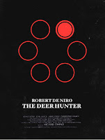
Others are confusing, yet portray something so important to the movie. One of my favorites is the one for “The Deer Hunter.” It shows six circles. Five are empty, and one is shaded red. Even people who love the movie will be confused at first. Think. Think very hard. Yes, it is portraying a gun with one bullet in it, loaded for Russian Roulette. With this image, such a deep and complex film is boiled down to its most basic, yet most important idea. Who needs an image of helicopters flying through Vietnam when you can just have a picture of the barrel of a gun?
There are others in the spirit of the “Inception” poster. The “Blade Runner” poster has no epic image of futuristic Los Angeles. All it has is that little origami unicorn. The poster for “Inglourious Basterds” shows two hands holding up three fingers in different ways. It’s the German three and the English three. It’s yet another small detail that made a very big difference in this movie.
Some posters are even more thought provoking and even more creative. The pattern on “The Shining” poster is the carpeting of The Overlook Hotel. The “Titanic” poster is not just a white triangle, it’s that deadly iceberg. Some add on to certain movies as well. “The Godfather” poster shows the rest of the horse’s body without the head. That is, if you really wanted to know what a headless horse looked like.
At the moment, Minimalist posters are fan art. They are made by and for people who truly appreciate movies. Yet, I feel like this new art form has a bigger potential. Why not actually use Minimalist posters to market movies? They’re better and more original than most of the generic crap passed off as posters nowadays. As a marketing tool, movie posters should draw people into a movie with a curiosity factor. If someone sees a “Kill Bill” poster with nothing but footsteps, they might wonder, where do those footsteps lead?
But posters shouldn’t just be for marketing. A movie poster should serve the same purpose as an album cover. They should converse with the art, and emphasize a central purpose behind it. A poster of the incredible futuristic Los Angeles from “Blade Runner” might draw more attention, but that unicorn is much more important to the story. You could compare that to the cover of “London Calling.” It could’ve just been an image of London being caught in the middle of the apocalypse. While the simple image of Joe Strummer smashing a guitar may seem out of place, it’s really there to show the raw, unbridled power of true rock and roll that the album is partially a metaphor for.
That simple image of a mythical creature, or the inside of a gun are not the first things you’d expect to see on a good movie poster. But like that album cover, they show the strange, mesmerizing magic of truly amazing cinema. The poster is meant to encapsulate an entire film in one image. In so simple an image, so much more can be said.
I couldn’t find the “Inception” poster I was referring to earlier, but here is another cool one.
